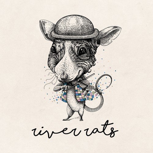
In a world overflowing with sleek, modern branding, vintage designs remain an enduring favorite for businesses looking to evoke nostalgia, trust, and timelessness. Whether you’re a small business owner, designer, or entrepreneur, knowing how to create a vintage logo that feels authentic yet fresh is a valuable skill—especially as we head into 2025, where retro aesthetics continue to make bold statements across industries.
So, how do you craft a vintage logo illustration that genuinely stands out in this new era? Let’s break it down step by step.
Why Vintage Logos Still Work Today
Before diving into the how-to, it’s worth understanding why vintage logos continue to resonate.
A vintage logo taps into the emotional power of nostalgia. It signals heritage, quality, and a sense of “the good old days.” This is why craft breweries, boutique coffee shops, barbershops, and artisanal brands often use vintage logo illustration styles to communicate authenticity and craftsmanship.
However, in 2025, not every retro logo will cut it. Consumers are savvier and more design-literate than ever. A cliché or poorly executed design can make your brand feel dated instead of timeless.
Step 1: Research Classic Design Elements
Start by immersing yourself in the era or vibe you want your vintage logo to convey. Do you want to channel the roaring 1920s, the rugged 1950s Americana, or the funky 1970s? Each decade has distinct visual cues—typography, color palettes, textures, and iconography.
For example:
- 1920s Art Deco: bold geometry, elegant lines, metallic colors.
- 1950s Retro: script fonts, neon colors, diner motifs.
- 1970s Vintage: earthy tones, hand-drawn elements, groovy typefaces.
Study old signage, packaging, and advertisements. Pinterest, vintage magazines, and antique stores can be great sources of inspiration for your vintage logo illustration.
Step 2: Choose Authentic Fonts and Typography
Typography makes or breaks a vintage logo. Modern sans-serifs can look too contemporary for a retro vibe. Instead, pick fonts inspired by your chosen era. For a truly custom feel, many designers tweak or hand-letter fonts to add imperfections, giving the logo an organic, handcrafted look.
Don’t be afraid to combine fonts—pair a bold serif with a script for contrast, just like many mid-century logos did. Pay attention to letter spacing, curves, and decorative flourishes.
Step 3: Pick a Classic Color Palette
Vintage logos rarely use bright, ultra-saturated digital colors. Instead, they rely on muted, earthy, or faded tones. Think cream, deep navy, burnt orange, forest green, and rustic browns. These colors evoke warmth and authenticity.
A helpful trick: apply a subtle texture or grain to your colors to make them feel aged, like they’ve lived a life outside a computer screen.
Step 4: Add Meaningful Illustrations or Icons
Illustrative elements are where your vintage logo illustration comes to life. Hand-drawn badges, crests, or icons add character and help tell your brand’s story. For example, a vintage barbershop might feature scissors and a straight razor, while a craft coffee roaster might include beans, leaves, or an old roaster.
Keep your illustrations simple and avoid too much detail—vintage logos often have bold, recognizable shapes that read well at any size.
Step 5: Embrace Texture and Imperfection
The charm of vintage logos is often in their imperfections. Perfectly crisp vector lines can feel cold and too modern. Consider adding subtle textures—grunge, worn edges, or print-like effects—to simulate the look of old letterpress or screen printing.
There are countless brushes and textures available online to give your design that timeworn feel. Just remember: subtlety is key. Too much texture can muddy your logo.
Step 6: Test for Versatility
A great vintage logo should look good on anything: business cards, packaging, signage, merchandise, or digital screens. Check that your design holds up in black and white, in small sizes, and on different backgrounds.
A popular approach is to create a main logo and a few “submarks” or alternate versions—badges, monograms, or wordmarks—that can be used flexibly across branding materials.
Step 7: Combine Vintage with Modern for a Fresh Twist
Here’s the secret sauce for 2025: don’t get stuck in the past.
Modern consumers appreciate a vintage vibe, but they also expect brands to feel relevant. Many successful designers now merge retro elements with clean layouts, contemporary colors, or minimalist touches.
For example, pair a rugged vintage badge with sleek typography. Or use a classic color palette but keep the overall layout uncluttered. This blend helps your brand feel nostalgic yet fresh—a winning combination.
Step 8: Get Feedback
Once you’ve crafted your vintage logo, show it to people who represent your target audience. Does it communicate the story and feeling you intended? Does it stand out among competitors? Fresh eyes can catch details you might have missed.
Step 9: Hire a Specialist (If Needed)
If creating a vintage logo illustration feels overwhelming, don’t hesitate to collaborate with a designer who specializes in retro aesthetics. They’ll know how to balance authenticity with originality and ensure your logo looks unique, not like a generic throwback.
Platforms like Behance and Dribbble are excellent places to find designers with proven vintage portfolios.
Final Thoughts
A well-designed vintage logo is more than an old-timey graphic—it’s a visual handshake that says your brand has history, character, and soul. In 2025’s competitive landscape, a carefully crafted vintage logo illustration can help your business stand out in a sea of modern minimalism.
Take the time to research, experiment, and refine. Whether you’re channeling mid-century cool, rustic charm, or art deco elegance, the goal is to create something timeless yet alive—just like the legacy you want your brand to build.
So, sharpen your pencils (or stylus), dig into the past, and design a vintage logo that’s ready to thrive in the future.


